Metis IT
Positioning, brand & visual identity
Can you portray smarter IT in its optimal form?
IT by people, for people
Metis IT approached us to create their brand story and give them a more human face. We set up two sessions to get management and employees aligned behind a pertinent new positioning that is recognizable for all involved.
So what is Metis IT’s main strength? Not only do they fully understand — and get passionate about — technology, they also fully grasp the client’s business. And they know how to apply this knowledge to intricate solutions that serve the end user, so that every employee can do their job with the best IT support.
A company in its optimal form
IT architecture in its essence is the combination of server, storage, network & software components, creating an environment for applications to run. Tangram is the perfect metaphor for it: only experts know which shapes to configure in which way, in order to create it the final form.
This concept led to a clear-cut identity: a logotype built out of elementary shapes, with a subsequently rich visual style, both distinct and flexible. The campaign concept “Tangram head” represents the employee that lives and breathes IT, connecting the abstract world of IT with real-life people.
Now that Metis IT has introduced the style, they’ve found what employees, partners and applicants all want: to see IT in its optimal form.

The new website sets Metis IT apart from the competition with its characteristic form and client-focused content. Joshua Blokland was the amazing developer.

Metis IT’s work is invisible to most users’ eyes, but their efforts are felt and appreciated by their clients. We placed the convincing testimonials prominently on the homepage.

The website is in its optimal form on all devices.

The visual language is derived from Tangram. We make full use of the opportunities for variation this provides, while keeping a consistent feel.

Letterhead in this day and age: subtle branding and optimally workable email signatures.


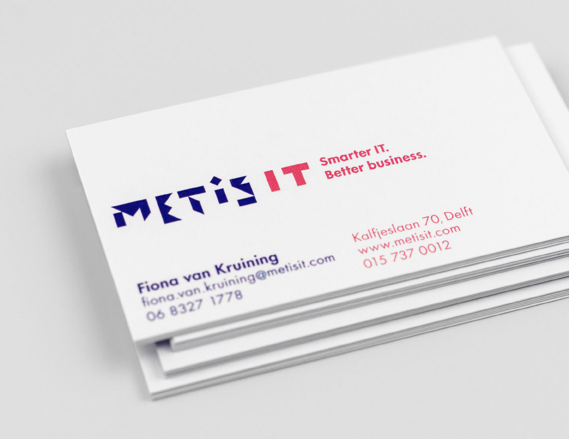
Business cards — we love how print allows us to fully brand the reverse side of the card — can’t do that with an email.
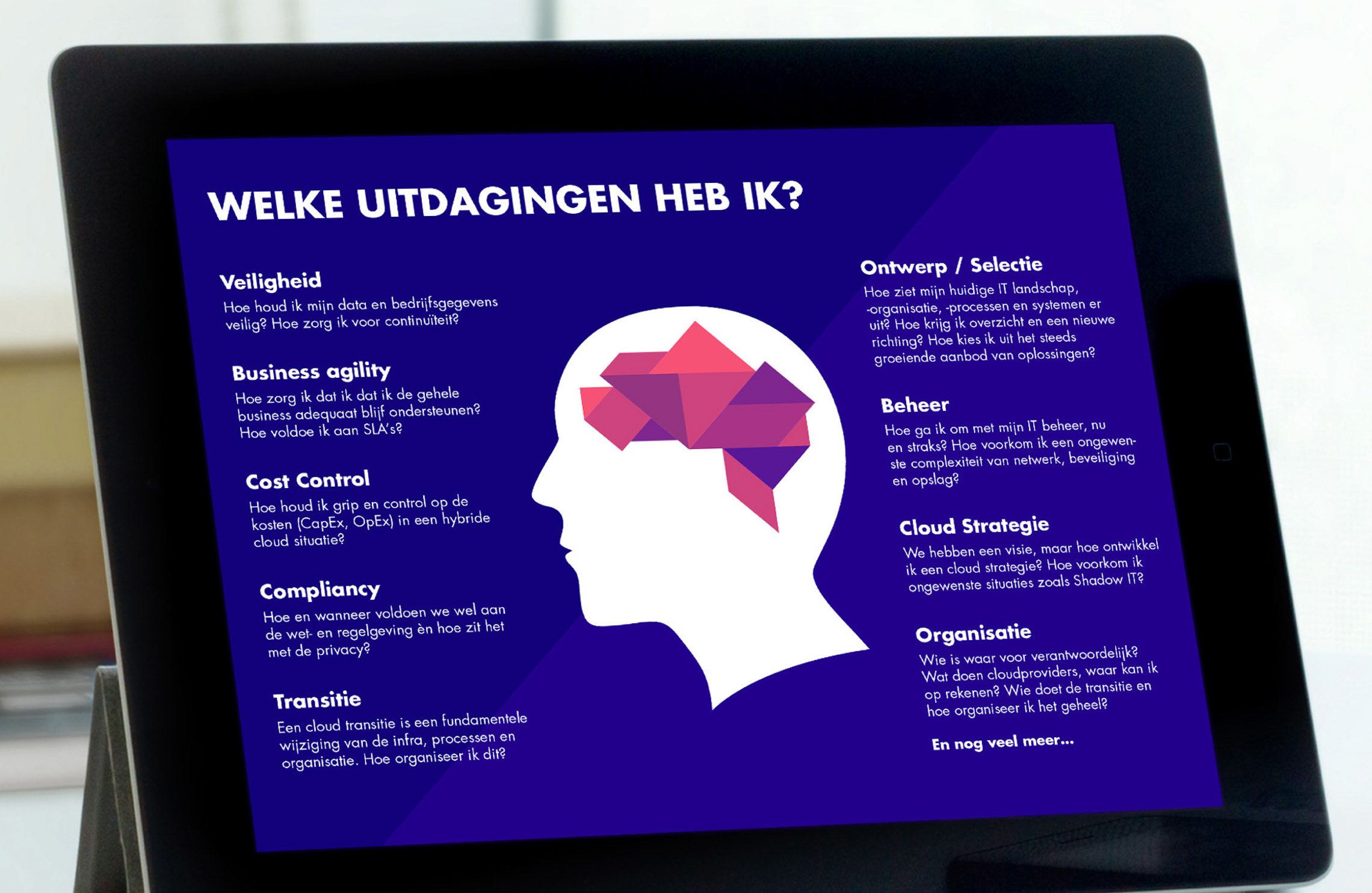
The visual language being applied more diversely — this presentation is an excellent example of content merging with branding.

Metis IT’s brand story for external use is not only a gripping tale, it also has a perfectly geometrical visual construction.


We translated “living and breathing IT” to a campaign concept that hits home with the target audience.

The concept is applied to a series that shows diversity in talent.

Clients and prospects are invited to solve a branded Tangram puzzle. By doing so, they experience Metis IT’s challenges through this perfect metaphor. This puzzle is directly printed on wood and lasercut.

Metis IT's brand story was published as a brand passport for employees and freelancers. The die-cut cover and geometrical layout round out the branding.

Is it a bird? Is it a plane?
It’s the interior of the brand passport.


The visual identity can also be applied playfully. At the request of the employees stickers were created to brand their most important tool.
Creating a fitting and lasting logo
We don’t just draw a pretty logo — the idea has to have its origin in the organisation’s DNA. This ensures that the organisation will embrace the style for a reason other than taste and leads to lasting solutions.
IT is often associated with zeroes and ones and software and hardware, while in fact the subject is very abstract. Additionally, in every case we must decide whether to portray what the organization does or the manner in which it operates. And how much can you put into the logo without confounding the message?
Keeping in mind Metis IT’s personality, it’s easy to choose from the options below. Their strength is bringing together multiple components into one finely tuned whole. Tangram illustrates this idea perfectly: elementary shapes combined into one strong logotype.

In the concept phase we research possibilities for branding from the subject matter and visual form, to discover the solution that best communicates what the organization stands for.